DRY: Don’t Repeat Yourself
Don’t repeat yourself (DRY) is a valuable software design principle. Some specific implications:
avoid typing the same thing repeatedly;
avoid using cut and paste;
automate what you can.
ggplot seems to make following this principle a little challenging, but there are things ggplot lets you do. Some examples:
Capture intermediate states of your plots in variables.
Move common
aesspecifications to the initialggplotcall.
R allows you to define functions that abstract the generic operations from the details you want to vary.
You can define a function that allows you to repeat an analysis or recreate a graph when the data is updated.
You can try to make your function flexible enough to allow for different data sets with different variables.
For
ggplotyou can try to create new components that play well with features like faceting.For
latticeyou can try to develop a panel function that works well in that framework.
I am trying to follow the two ggplot recommendations in my examples, not always successfully.
We can look at the barley yields slope graph as an example.
p <- basic_barley_slopes
p +
theme(panel.background = element_blank(),
      panel.grid = element_blank(),
      axis.ticks = element_blank(),
      axis.text.y = element_blank(),
      axis.title = element_blank(),
      panel.border = element_blank()) +
    scale_x_discrete(position = "top")
–>
Defining a Theme Function
Defining a theme_slopegraph function to do the theme adjustment allows the adjustments to be easily reused:
theme_slopechart <- function(toplabels = TRUE) {
    thm <- theme(panel.background = element_blank(),
                 panel.grid = element_blank(),
                 axis.ticks = element_blank(),
                 axis.text.y = element_blank(),
                 axis.title = element_blank(),
                 panel.border = element_blank())
    if (toplabels) list(thm, scale_x_discrete(position = "top"))
    else thm
}

p <- basic_barley_slopes ## from twonum.R
p + theme_slopechart()
This function makes placing the labels on the top optional.
Combining components like this has to use
listinstead of+.
Defining a Plot Construction Function
Abstracting the construction into a simple function allows us to vary some of the settings:
barley_slopes <- function(data, textsize = 3) {
    p <- ggplot(data, aes(x = year, y = avg_yield, group = site)) + geom_line()
    p + geom_text_repel(aes(label = paste0(site, ", ", round(avg_yield, 1))),
                        hjust = "outward", direction = "y") +
        theme_slopechart()
}

barley_slopes(absy)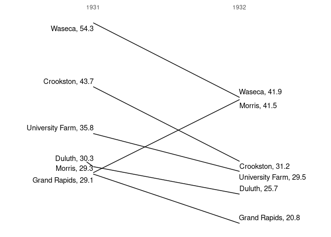
This is not a general slope chart function: the variable names year and avg_yield are hard wired.
To pull out the dependence on our variable names we can
- have the aesthetic mapping created outside our function;
- refer to the
yvariable as..y..; - use a new aesthetic, say
id, to specify the group and label:
slopechart0 <- function(data, mapping, textsize = 3) {
    p <- ggplot(data, mapping) + geom_line(aes(group = ..id..))
    p + geom_text_repel(aes(label = paste0(..id.., ", ", round(..y.., 1))),
                        size = textsize, hjust = "outward", direction = "y") +
        theme_slopechart()
}

slopechart0(absy, aes(x = year, y = avg_yield, id = site))
## Warning: The dot-dot notation (`..id..`) was deprecated in ggplot2 3.4.0.
## ℹ Please use `after_stat(id)` instead.
## This warning is displayed once every 8 hours.
## Call `lifecycle::last_lifecycle_warnings()` to see where this warning was
## generated.
It would be nice to avoid creating the
idaesthetic, but it seems necessary as..group..has been converted to an integer.Allowing an option to specify the number of digits for rounding is possible but is tricky because of the non-standard evaluation of the
aesarguments. (It can be done with a combination ofaes_andsubstitute).An alternative is to make adding the values optional.
To allow better interaction with faceting we can pull out the theme_slopechart call and also allow labels to be omitted by specifying textsize = 0:
slopechart <- function(data, mapping, textsize = 3) {
    p <- ggplot(data, mapping) + geom_line(aes(group = ..id..))
    if (textsize > 0)
        p + geom_text_repel(aes(label = paste0(as.character(..id..), ", ",
                                               round(..y.., 1))),
                            size = textsize, hjust = "outward", direction = "y")
    else p
}

slopechart(absy, aes(x = year, y = avg_yield, id = site)) + theme_slopechart()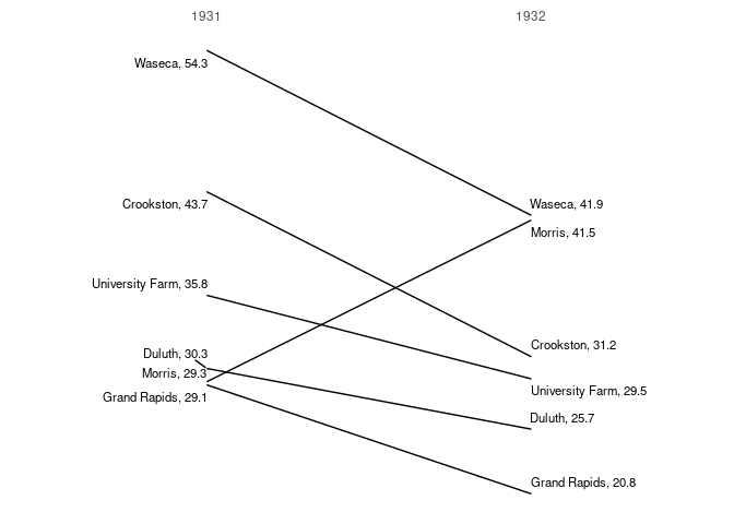
Using faceting and line types instead of labels:
slopechart(barley, aes(x = year, y = yield, id = site, linetype = site),
           textsize = 0) +
    theme_slopechart() + facet_wrap(~ variety)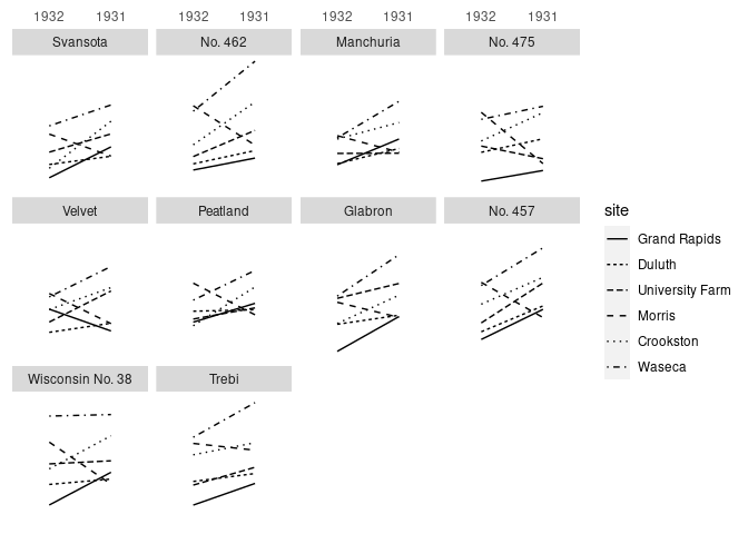
A more general approach would be to define a geom_slopechart that can be used at any layer level.
A simple version might be
geom_slopechart <- function(textsize = 3) {
    list(geom_line(aes(group = ..id..)),
         geom_text_repel(aes(label = paste0(..id.., ", ", round(..y.., 1))),
                         size = textsize, hjust = "outward", direction = "y"))
}

ggplot(barley, aes(x = year, y = yield, id = site, linetype = site)) +
    geom_slopechart(textsize = 0) +
    theme_slopechart() + facet_wrap(~ variety)
This isn’t quite right:
- it dos not allow data or mapping to be specified;
- it does not make sure
xis a factor; - …
The Extending ggplot2 vignette in the ggplt2 package provides some hints on how to do a more complete job.
As is, it does handle three levels reasonably:
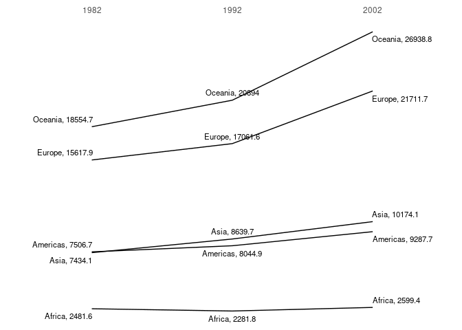
library(gapminder)
g1 <- filter(gapminder, year %in% c(1982, 1992, 2002))
m1 <- summarize(group_by(g1, continent, year), mean_gdpp = mean(gdpPercap))
## `summarise()` has grouped output by 'continent'. You can override using the
## `.groups` argument.
m1 <- mutate(m1, year = factor(year))
ggplot(m1, aes(x = year, y = mean_gdpp, id = continent)) +
    geom_slopechart() +
    theme_slopechart()